Grading New Uniforms for the 2012-13 NBA Season (PHOTOS)
The 2012 NBA season is right around the corner, and lots of teams have adjusted their uniforms. Hey, sign of the times: even Notre Dame football got limited-edition uniforms for a game this season. So the NBA’s new jerseys are following the trend. Alternates are still being revealed, but we’re not getting into the one-off Christmas Day unis.
Seems like everyone has an opinion on the new looks, so we thought we’d jump in and grade the new uniforms for the 2012-13 NBA season. All unis are rated on a scale of 1 to 10, with 10 being incredibly cool and 1 being, well, pretty lame.
San Antonio Spurs
Photo Via Rare Air Sneakers
The Spurs’ new look seems kind of plain. They don’t even identify the team’s city or team name on the front of the jersey. Both the logo and the number are off-center, which makes it seem like something’s missing. Some have wondered whether the jerseys are inviting sponsors; there’s certainly room for another logo. Overall, the uni is a little drab, but we’ll give it a point for originality.
Grade: 6/10
New York Knicks
Photo Via NY Times Off the Dribble Blog
Very small changes here. Gone are the black trim and NYC Subway token formerly featured on the waistband of the shorts. It their place, the Knicks are rolling with a blue stripe, and silver instead of black, which is a welcome change. Too many pro teams use black trim. Will the blue waistband be distracting? Probably. But it’s still an upgrade.
Grade: 7/10
Denver Nuggets
Photo Via Times Union
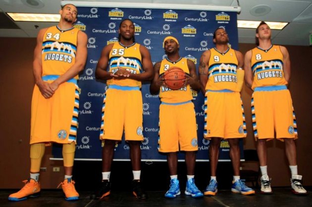
Obviously influenced by their throwback logo from the 70s and 80s, the Nuggets are trying to have the best of both worlds—a traditional design (the mountain peaks) with more modern touches. The look is extremely similar to the current design for Marquette University’s basketball team. What’s with copying the checkerboard pattern on the sides? We’re docking points for lack of originality.
Grade: 6/10
Cleveland Cavaliers
The Cavs will wear their updated yellow alternates on opening night, and they’ll rotate them in throughout the year. The block letters on the front of the jersey works better than the script “Cavaliers” of years past, and the unis have a simple, clean design. These are winners.
Grade: 8/10
Charlotte Bobcats
This one’s tough. Clearly, the design is an upgrade for a team still struggling to find its on-court identity. But the look is nearly exactly the same as the Mavericks and the Thunder. It’s like those two team uniforms got married and had a baby, and the baby is the new Bobcats design. Still, the new home whites are a big improvement over these, and these.
Grade: 8/10
Brooklyn Nets
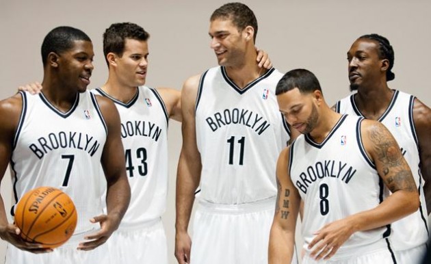
New city, new logo, new uniforms. That’s how it goes. This is a huge upgrade for the Nets. Gone is the red, white and blue design of the New Jersey Nets, and in its place is a simplified black and white color scheme. These classic jerseys are certainly welcome after years of this.
Grade: 9/10
What’s your favorite new look for new season? Let us know on Twitter or Facebook.
RECOMMENDED FOR YOU
Grading New Uniforms for the 2012-13 NBA Season (PHOTOS)
The 2012 NBA season is right around the corner, and lots of teams have adjusted their uniforms. Hey, sign of the times: even Notre Dame football got limited-edition uniforms for a game this season. So the NBA’s new jerseys are following the trend. Alternates are still being revealed, but we’re not getting into the one-off Christmas Day unis.
Seems like everyone has an opinion on the new looks, so we thought we’d jump in and grade the new uniforms for the 2012-13 NBA season. All unis are rated on a scale of 1 to 10, with 10 being incredibly cool and 1 being, well, pretty lame.
San Antonio Spurs
Photo Via Rare Air Sneakers
The Spurs’ new look seems kind of plain. They don’t even identify the team’s city or team name on the front of the jersey. Both the logo and the number are off-center, which makes it seem like something’s missing. Some have wondered whether the jerseys are inviting sponsors; there’s certainly room for another logo. Overall, the uni is a little drab, but we’ll give it a point for originality.
Grade: 6/10
New York Knicks
Photo Via NY Times Off the Dribble Blog
Very small changes here. Gone are the black trim and NYC Subway token formerly featured on the waistband of the shorts. It their place, the Knicks are rolling with a blue stripe, and silver instead of black, which is a welcome change. Too many pro teams use black trim. Will the blue waistband be distracting? Probably. But it’s still an upgrade.
Grade: 7/10
Denver Nuggets
Photo Via Times Union
Obviously influenced by their throwback logo from the 70s and 80s, the Nuggets are trying to have the best of both worlds—a traditional design (the mountain peaks) with more modern touches. The look is extremely similar to the current design for Marquette University’s basketball team. What’s with copying the checkerboard pattern on the sides? We’re docking points for lack of originality.
Grade: 6/10
Cleveland Cavaliers
The Cavs will wear their updated yellow alternates on opening night, and they’ll rotate them in throughout the year. The block letters on the front of the jersey works better than the script “Cavaliers” of years past, and the unis have a simple, clean design. These are winners.
Grade: 8/10
Charlotte Bobcats
This one’s tough. Clearly, the design is an upgrade for a team still struggling to find its on-court identity. But the look is nearly exactly the same as the Mavericks and the Thunder. It’s like those two team uniforms got married and had a baby, and the baby is the new Bobcats design. Still, the new home whites are a big improvement over these, and these.
Grade: 8/10
Brooklyn Nets
New city, new logo, new uniforms. That’s how it goes. This is a huge upgrade for the Nets. Gone is the red, white and blue design of the New Jersey Nets, and in its place is a simplified black and white color scheme. These classic jerseys are certainly welcome after years of this.
Grade: 9/10
What’s your favorite new look for new season? Let us know on Twitter or Facebook.


