All of the Recently Redesigned NFL Uniforms, Ranked
![]()
When you think Nike, you automatically think Oregon football and its legion of different uniform combinations. And while Phil Knight and the gang have turned Nike-sponsored schools into platforms on which to experiment with new colors, patterns and designs, they’ve recently extended their tentacles to the NFL. Over the past few years, six teams have had their uniforms redesigned by the good people of Beaverton, Oregon, and the results thus far have been mixed. With the Cleveland Browns becoming the latest franchise to have their uniforms transformed, we ranked the six teams, because everyone loves a good ranking.
1. Seattle Seahawks
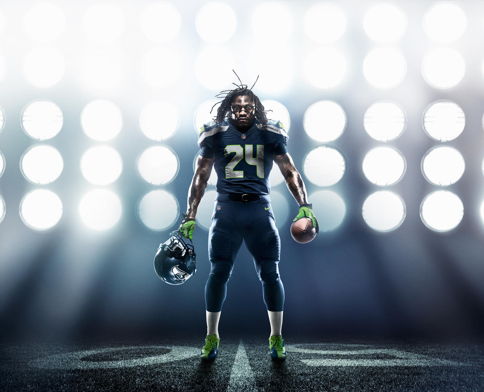
The crown jewel. What every NFL team strives for. The Seahawks took a bird that chills by the sea and turned it into a ferocious beast that will steal the fish right off your fishing rod then drop it back in the ocean just to watch you flip out.
The volt green is used subtly, outlining the gray numbers and popping off the shoulders. The wolf gray and navy blue play off each other beautifully on the home iteration, while the gray, alternate uni with blue numbers and volt accents is the best of the bunch.
The Hawks uniforms pull off a modern look without looking like they belong in the year 2060. That’s not small feat. Just ask Tampa Bay.
2. Minnesota Vikings
Nothing drastic here, just a super duper clean look. The numbering and stripes on the shoulders made to resemble the curvature of the bow of a Viking ship is an incredibly detailed and cool touch, but the best was left for the helmet. An enlarged Viking horn is the big change, and the helmet became one of the first in the NFL to use a matte coloring. The Vikes took a mascot that had the potential to be incredibly cheesy and used it in the classiest way possible on these new threads.
3. San Francisco 49ers
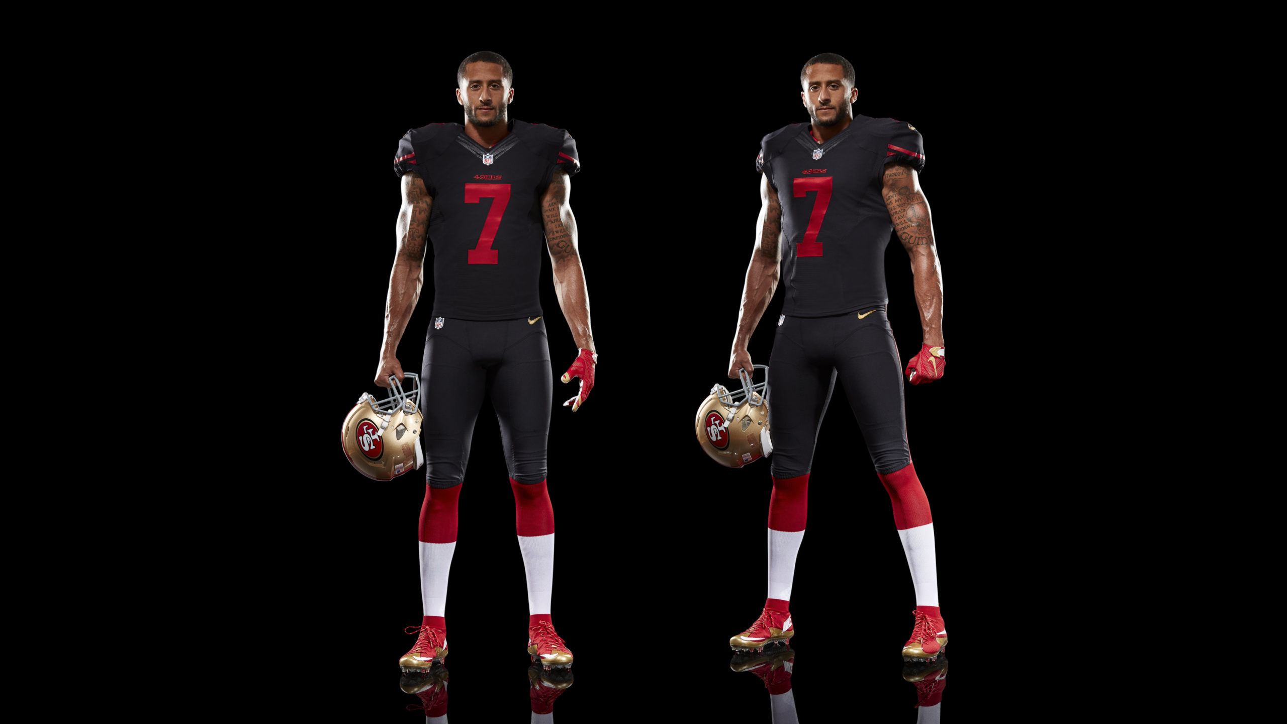
The Niners debuted some new threads back in 2012, but this all-black with red accents alternate is the definition of flames. They should just wear this iteration for all home games to counteract the softness of naming your stadium after a pair of jeans.
San Francisco’s gold helmets look incredible against the black jerseys. The Niners should have released this bad boy a long time ago.
4. Cleveland Browns
There’s a lot to like about the Cleveland Browns’ new threads, a significant departure from a uniform that has gone largely unchanged throughout its history, but there’s also some swings and misses.
While the new, brighter orange certainly pops on the jerseys and pants (those brown ones aren’t so bad themselves), the Browns missed a chance to really do something cool with the helmet. The team says it is indeed a matte finish, but it doesn’t look much different from the original. A chrome orange or something that shines just a tad more would have done wonders. The words “Dawg Pound” inscribed on the neckliner is a cool detail, but the “Cleveland” across the chest looks a little cartoonish and is reminiscent of a collegiate uniform. All in all, it’s a nice new look that could have been even doper with some tweaks here and there.
5. Miami Dolphins
If the Vikings went simple but clean, the Miami Dolphins went straight boring. There’s not much more here but white and aqua, as the team did away with the orange that used to highlight the color scheme, save for the outlines of the numbering. And the aqua looks much more like a chemical-filled fish tank than the serene coloring of the Atlantic Ocean.
So while the uniforms aren’t awful, there’s just not a whole lot here to get excited about. The only thing the team did do right is remove that ridiculous helmet from its dolphin logo.
6. Jacksonville Jaguars
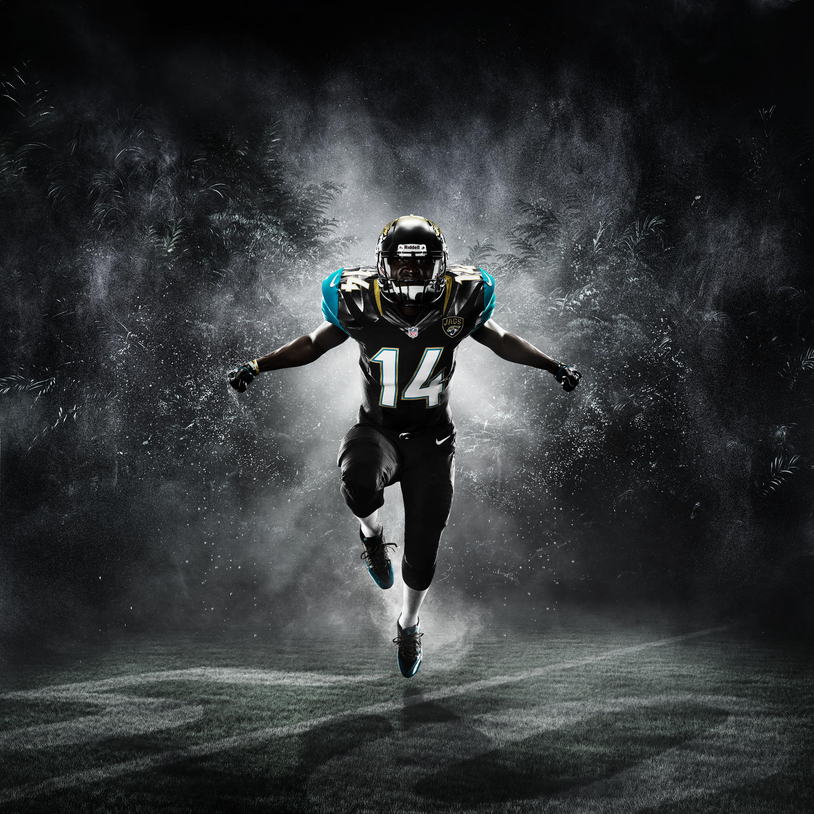
In an attempt to be modern, the Jags went a little too far with their uniform redesign. Fading their helmet from gold to black is a cool idea on paper, but once it was put into action the results were far less enjoyable. The all-black look works best, with the gold stripes running down the shoulder providing a nice contrast, but the green/turqiouse coloring is a turn off and used far too much throughout the three new threads.
7. Tampa Bay Buccaneers
How the Buccaneers brass saw this design, OK’d it, then saw it on field and still thought “THIS IS AWESOME!” is beyond me, but hey, they also have a fake pirate ship in their stadium, so maybe it shouldn’t come as a surprise.
Everything about these threads is awful. The horrid brown coloring on the pants and shoulders. The numbering that looks like your alarm clock, which also happens to be the thing you hate the most in the mornings. The huge Buccaneers logo that looks like it should be plastered across a pirate-themed ride at Six Flags. Anyone else feel another redesign coming in a couple of years? Everyone? Great.
RECOMMENDED FOR YOU
All of the Recently Redesigned NFL Uniforms, Ranked
![]()
When you think Nike, you automatically think Oregon football and its legion of different uniform combinations. And while Phil Knight and the gang have turned Nike-sponsored schools into platforms on which to experiment with new colors, patterns and designs, they’ve recently extended their tentacles to the NFL. Over the past few years, six teams have had their uniforms redesigned by the good people of Beaverton, Oregon, and the results thus far have been mixed. With the Cleveland Browns becoming the latest franchise to have their uniforms transformed, we ranked the six teams, because everyone loves a good ranking.
1. Seattle Seahawks

The crown jewel. What every NFL team strives for. The Seahawks took a bird that chills by the sea and turned it into a ferocious beast that will steal the fish right off your fishing rod then drop it back in the ocean just to watch you flip out.
The volt green is used subtly, outlining the gray numbers and popping off the shoulders. The wolf gray and navy blue play off each other beautifully on the home iteration, while the gray, alternate uni with blue numbers and volt accents is the best of the bunch.
The Hawks uniforms pull off a modern look without looking like they belong in the year 2060. That’s not small feat. Just ask Tampa Bay.
2. Minnesota Vikings
Nothing drastic here, just a super duper clean look. The numbering and stripes on the shoulders made to resemble the curvature of the bow of a Viking ship is an incredibly detailed and cool touch, but the best was left for the helmet. An enlarged Viking horn is the big change, and the helmet became one of the first in the NFL to use a matte coloring. The Vikes took a mascot that had the potential to be incredibly cheesy and used it in the classiest way possible on these new threads.
3. San Francisco 49ers

The Niners debuted some new threads back in 2012, but this all-black with red accents alternate is the definition of flames. They should just wear this iteration for all home games to counteract the softness of naming your stadium after a pair of jeans.
San Francisco’s gold helmets look incredible against the black jerseys. The Niners should have released this bad boy a long time ago.
4. Cleveland Browns
There’s a lot to like about the Cleveland Browns’ new threads, a significant departure from a uniform that has gone largely unchanged throughout its history, but there’s also some swings and misses.
While the new, brighter orange certainly pops on the jerseys and pants (those brown ones aren’t so bad themselves), the Browns missed a chance to really do something cool with the helmet. The team says it is indeed a matte finish, but it doesn’t look much different from the original. A chrome orange or something that shines just a tad more would have done wonders. The words “Dawg Pound” inscribed on the neckliner is a cool detail, but the “Cleveland” across the chest looks a little cartoonish and is reminiscent of a collegiate uniform. All in all, it’s a nice new look that could have been even doper with some tweaks here and there.
5. Miami Dolphins
If the Vikings went simple but clean, the Miami Dolphins went straight boring. There’s not much more here but white and aqua, as the team did away with the orange that used to highlight the color scheme, save for the outlines of the numbering. And the aqua looks much more like a chemical-filled fish tank than the serene coloring of the Atlantic Ocean.
So while the uniforms aren’t awful, there’s just not a whole lot here to get excited about. The only thing the team did do right is remove that ridiculous helmet from its dolphin logo.
6. Jacksonville Jaguars

In an attempt to be modern, the Jags went a little too far with their uniform redesign. Fading their helmet from gold to black is a cool idea on paper, but once it was put into action the results were far less enjoyable. The all-black look works best, with the gold stripes running down the shoulder providing a nice contrast, but the green/turqiouse coloring is a turn off and used far too much throughout the three new threads.
7. Tampa Bay Buccaneers
How the Buccaneers brass saw this design, OK’d it, then saw it on field and still thought “THIS IS AWESOME!” is beyond me, but hey, they also have a fake pirate ship in their stadium, so maybe it shouldn’t come as a surprise.
Everything about these threads is awful. The horrid brown coloring on the pants and shoulders. The numbering that looks like your alarm clock, which also happens to be the thing you hate the most in the mornings. The huge Buccaneers logo that looks like it should be plastered across a pirate-themed ride at Six Flags. Anyone else feel another redesign coming in a couple of years? Everyone? Great.


