The Real Meaning Behind 44 Popular Sports Logos
What’s in a name? In the sports world, it is the image behind the name that gives the company its traction. As we are bombarded with image after image in our everyday lives, take a minute to check out some of the most interesting stories behind the logos of the most recognizable names in sports.
Nike
In 1971, Nike co-founder and then accounting professor Phil Knight commissioned a Portland State college graphic design student named Carolyn Davidson to design a logo that conveys motion and would look good on a shoe. Davidson spent more than 17 hours on the project, coming up with dozens of options, including what would become one of the world’s most recognizable logos, the Nike Swoosh.
Knight said of the logo, “I don’t love it, but it will grow on me.” Davidson was paid $35 dollars for her work, and later received stock options, which presumably wound up being worth much, much more. The company eventually changed its name from Blue Ribbon Sports to Nike, after the Greek goddess of victory.
adidas
Adidas was born after the fallout of two shoemaking brothers, Rudolf and Adolf “Adi” Dassler. Adi would claim that the name adidas is an acronym for “All Day I Dream About Sports,” but one can’t help but notice that the name could also be a combination of his nickname and last name (Adi Das).
Adi came up with the three stripes in 1967, because he wanted a logo that was simple but that stuck in customers’ memories. The original slogan was “The Brand with the 3 Stripes,” with no real significance behind the design.
In 1972, Adi created a new design, the trefoil—which was, still in keeping with the three stripes, meant to represent the versatility of the company. Not simply focused on shoes anymore, the company now sold apparel and other lifestyle items.
In 1990, the creative director at the time proposed that the three stripes be slanted, like a mountain, implicitly representing the obstacles and challenges athletes must overcome in order to be successful.
Oh, and Rudolf? He went on to create the brand now known as Puma.
Reebok
Starting in the United Kingdom in 1895, the Reebok logo featured a Union Jack flag, for its locale and humble beginnings. The name came from the Afrikaans (one of the official languages of South Africa) word “rhebok,” a type of antelope or gazelle.
In 1986, Reebok introduced the “vector” logo,” a streak across a racing track, inspired by its product designs of the time, “side stripe” and “cross check.” The vector was also meant to symbolize the company’s new era of “performance” products.
The newest course for the Reebok logo is the CrossFit delta, as the brand allies itself closer to “the sport of fitness.” From the official press release: “The new Reebok Delta symbol represents the positive and transformative change that fitness can have on a person’s life. Through the millennia the delta has been a symbol of change and transformation. The Reebok Delta has three distinct parts each representing the changes—physical, mental, and social—that occur when people push themselves beyond their perceived limits and embrace an active and challenging life.”
Under Armour
At the University of Maryland in 1996, a young student-athlete named Kevin Plank decided he didn’t want to work out in sweat-soaked cotton t-shirts anymore. Plank researched the athletic benefits of synthetic fabrics, then designed a compression T-shirt, the first UA HeatGear shirt.
The UA logo is a U layered with an A, simple and plain. The name was inspired by the term “body armor.” Plank’s brother Bill accidentally called it Under Armour one day, and the name stuck.
Arizona Cardinals
In 1901, team owner Chris O’Brien purchased used maroon jerseys from the University of Chicago (where the franchise played in the NFL’s initial years.) He called the new uniforms “Cardinal red”—from which a nickname burst forth.
The cardinal officially became part of the logo in 1947, the cardinal head was on the helmet in 1960. In 2005, the cardinal-head logo was updated to look sleeker, fiercer perhaps, though some have called it a “parakeet.”
Atlanta Falcons
The Falcons joined the NFL in 1965. A local radio station sponsored a contest to name the team, and more than 500 names were submitted. School teacher Julia Elliott was singled out for suggesting Falcons because “the Falcon is proud and dignified, with great courage and fight. It never drops its prey. It is deadly and has a great sporting tradition.” And, in case you haven’t noticed, the bird is in the shape of the letter F.
Baltimore Ravens
The Baltimore Sun hosted a phone-in-vote to help decide the team name in 1996, when it relocated from Cleveland. The clear and majority winner was the Ravens—which is a reference to Edgar Allen Poe’s famous poem “The Raven.” Poe is buried in Baltimore.
The current version of the Baltimore Ravens logo, unveiled in 1998, consists of a raven’s head with the letter B superimposed on its left side. Before the profile of an angry looking bird, however, was a shield with wings coming out of either side, and a “cross bottony” (a cross with buds), which is part of the Maryland flag. Since the bottony has a trefoil-like shape on the ends, with three lobes, it is also considered a symbol for the trinity of Christianity. Thus, after two seasons in Baltimore, they nixed it.
Chicago Bears, Detroit Lions
Both of these clubs derived their names from their cities’ baseball teams (the Cubs and the Tigers). In the early 60’s the Bears used the old C used by the Cubs, and also by the Cincinnati Reds, and the Chicago Cardinals (before they would become the St. Louis Cardinals). (See Cincinnati Reds).
Green Bay Packers
Earl Lambeau, who founded the team, was employed by the Indian Packing Company, later renamed the Acme Packing Company. The company sponsored the team, provided equipment and access to the field, and the nickname was born. The G was designed by the equipment manager Gerald Brashierge with the help of an art student in 1961, which was Vince Lombardi’s third year as head coach. Since then, the Georgia Bulldogs in 1964 have been among those to adopt the design.
Indianapolis Colts
The Colts franchise was named in Baltimore in the early 1950s in honor of the region’s history of horse breeding. Not long after, the logo was inscribed as two horseshoes on the back of the players’ helmets. The team’s primary logo did not include a horseshoe until 1961. It was a bucking horse wearing a helmet with a horseshoe on it. Since 1979, the solo horseshoe has been the team’s main logo. If the horseshoe is turned on its side, apparently bad luck, it forms a C.
RELATED: The 6 Best Now-Defunct Team Names in Pro Sports
Minnesota Vikings
The expansion franchise, in 1961, became the first pro football team to include its home state, rather than a city, in the team name. Like many other teams, the franchise held a contest for the team name, and Vikings was the winner, due to the Scandanavian culture of the region. The primary logo of the blond and bearded norsemen has been around since the team’s inception.
New Orleans Saints
The name is a nod to the city’s jazz heritage, taken from the song “When the Saints Go Marching In.” The team logo, a fleur-de-lis, is a stylized lily and decorative symbol that pays tribute to the French heritage of New Orleans.
New York Jets
Originally named the Titans, in 1963 the team was purchased by new owners, who considered calling their newly acquisition the “Gothams,” “Dodgers” or “Boroughs” before finally settling on “Jets,” since the team was to play at Shea Stadium, which is right by New York’s LaGuardia Airport.
Pittsburgh Steelers
Another team that started out with a name derived from the city’s baseball team, the Pirates, the Steelers were renamed in 1940 in a naming contest. The predominant choice was an homage to the thriving Pittsburgh steel mill industry. The team’s logo is based on the logo belonging to the American Iron and Steel Institute. The three star diamond-like shapes are a figure called an asteroid, a type of hypocycloids with four cusps. The Steelers are the only team to have a logo on only one side of their helmets.
San Diego Chargers
The name Chargers was chosen in a contest, supposedly because the team owner identified the name with the popular “Charge!” fan chant/bugle cry. The Chargers have used the logo of an arc-shaped lightning bolt in one way or another since the team debuted in 1960. However, the first logo was of a shield and upper body of a horse with the lightning bolt across his chest.
San Francisco 49ers
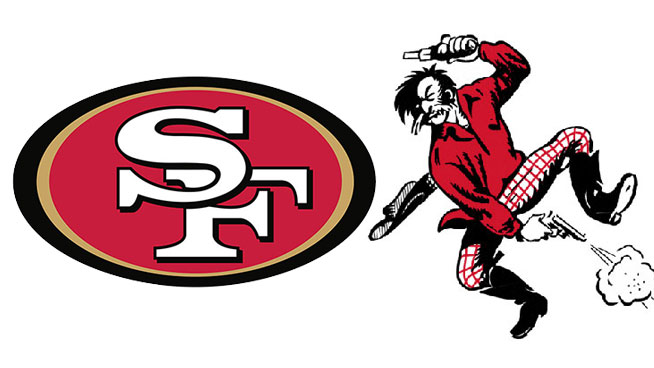
The 49ers are named after the gold rush of 1849 in the San Franciso area. The original logo featured a mustached gold miner dressed in a red shirt and plaid pants, jumping in mid-air and shooting a pistol in each hand. From 1962 on, the “SF” in the red oval became the staple, and was in keeping with the red from the original miner guy logo.
St. Louis Rams
The owner and general manager of the Rams stole the nickname from the (college) Fordham Rams, who were in their heyday at the time. In the 40s, when the franchise was located in Cleveland, the logo was a simple blue ram’s head, with its horns in a spiral.
The rams were the first team to put a logo on their helmets. In 1948, when they were located in Los Angeles, Rams halfback Fred Gehrke, who worked as a commercial artist in the off-season, designed a ram head for the helmet.
Arizona Diamondbacks
The Diamondback rattlesnake is common throughout the southwest. And, surprise! the name also applies to the baseball diamond.
The first logo in 1998 was an A with a diamond pattern on the left side, the bottom of an A forming a snakehead. One alternate logo is simply a snake in the shape of a D, keeping the ziz-zag element. Another shows a black lowercase D and B together, which form a snake head and tongue.
Cincinnati Reds
In 1868, Cincinnati was the first team to cover their shins with red stockings. The Red Stockings became the Reds in the 1870s. They were briefly nicknamed Redlegs in the 1950s to avoid association with the “red scare” of communism.
The “wishbone” C has been worn by the Reds since 1905. Since then it has become a baseball fixture (used by the Indians, the Twins, the White Sox and the Cubs) and has also been worn by the NFL Chicago Bears and the Chicago (today’s Arizona) Cardinals and others.
Chicago White Sox
The franchise started in Iowa, but moved to Chicago’s south side in 1900. When the north side team (then the Chicago White Stockings) switched its name to the Cubs, the Sioux City Cornhuskers took the White Sox name.
Over the years, the White Sox have had many logo switches, but the Roman-style S, with the small O and X inside the top and bottom loops of the S, has been one of the most enduring since 1912.
Baltimore Orioles
The Orioles are named for the state bird of Maryland. The team logo has gone back and forth over the years between a realistic-looking and cartoon bird. The Orioles’ caps were birdless for one year in 1963, replaced by a B.
Detroit Tigers
The Tigers wore yellow and black socks beginning in the early 1900s, which reminded observers of the Princeton University Tigers.
Although the Tigers have experimented over time with incorporating an actual tiger into their main logo, the Detroit “D” has endured.
Houston Astros
The Astros were renamed in 1965 for the new Johnson Space Center in Houston, the logo on the uniforms incorporating a shooting star. The team had previously been called the Colt .45s.
Kansas City Royals
A fan poll chose the Royals for the annual American Royal livestock show in Kansas City. An artist at Hallmark Cards in Kansas City designed the logo of a crown atop a shield, with the letters KC inside.
Los Angeles Dodgers
Originally located in Brooklyn and called the Bridegrooms, because many of the players got married around the same time, the team went by several other monikers before eventually going with “Dodgers,” because the city’s residents were good at evading the trolly street cars.
Minnesota Twins
The Twins are named for Minnesota’s “twin cities” of Minneapolis and St. Paul. Minnesota was the first city to have its baseball club use its state name rather than the city. In the logo, the “win” in Twins is underlined.
Oakland Athletics
The A’s were one of the first teams in the American League. In the early 1900s, New York Giants Manager John McGraw publicly dismissed the team by calling them the “white elephants.” A’s owner Connie Mack made the elephant the team masot, which has remained as an element in their logo ever since.
Pittsburgh Pirates
In 1907, the Pittsburgh Alleghenys were sold. In the process they picked up several players from the American Association, including Lou Bierbauer, who had played with the Philadelphia Athletics, a team that had failed to put the players on its reserve list. The Athletics were enraged and called the Alleghenys’ actions “piratical.” A new name was born.
Toronto Blue Jays
The name was selected from over 30,000 entries. The Blue Jay is an aggressive bird, indigenous to Ontario.
NBA
The NBA’s silhouette of a basketball player is actually modeled on one individual, Jerry West. Nicknamed “Mr. Clutch” for his performance in high pressure situations. West played his entire career with the Lakers.
In 1969, Alan Siegel designed the logo based on a picture of West dribbling down the court in Madison Square Garden.
The NBA is less forthcoming to acknowledge the logo as one player in particular. Siegel explains: “They want to institutionalize it rather than individualize it. It’s become such a ubiquitous, classic symbol and focal point of their identity and their licensing program that they don’t necessarily want to identify it with one player.”
Chicago Bulls
The team owner wanted a one-syllable name to match the Bears, Cubs and Sox, as well as to pay homage to the city’s meatpacking/animal stock industry.
Some say if you turn the logo upside down, you’ll see a robot reading a book on a bench.
Denver Nuggets
The Nuggets were named for the mining boom in Colorado in the 19th century.
Detroit Pistons
Fred Zollner, supplier of car pistons to companies like Ford and General Motors, founded the “Fort Wayne Zollner Pistons” in 1941. Zollner played a major role in the merger of the National Basketball League and the Basketball Association of America into the NBA.
Houston Rockets
Similar to the Houston Astros, the “Rockets” name connects with the Johnson Space Center in Houston. However, the team was originally founded in San Diego, a manufacturing site of Atlas rockets.
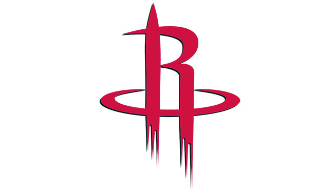
If you look at the logo, the R in the hoop is a rocket taking off, but there’s also a hidden H formed by the hoop and the R (and also a lowercase h within the R itself.)
The Indiana Pacers
Indiana has a history of both harness racing and auto racing. Besides the fact that one of the team’s early investors was a horse-racing enthusiast, the name combines the two, playing off of the pace car for the Indy 500.
Los Angeles Clippers
The Clippers, who played in San Diego from 1970 to 1977, were named for the town’s harbor, where Clipper Oil Company resides.
Los Angeles Lakers
The Lakers were located in Minnesota, the “Land of 10,000 Lakes,” until 1960. The name stuck when the team moved to Los Angeles.
Brooklyn Nets
Originally, the Nets were the New York Americans, but when changing the name, a reporter suggested the name should rhyme with “Mets” and “Jets.”
RELATED: 28 Better Nicknames Than The Pelicans for New Orleans’ NBA Team
New York Knicks
“Knickerbockers” were high knee pants worn by the early Dutch settlers.
Oklahoma City Thunder
After the Supersonics moved from Seattle to Oklahoma City in 2008, the team took up the name Thunder, referring both to its new location in “Tornado Alley,” and to OKC’s 45th Infantry Division, which is nicknamed the Thunderbirds.
Philadelphia 76ers
Originally the Syracuse Nationals in the NBL, the current team name references the birth of the United States in 1776.
Toronto Raptors
After narrowing the choices down from a contest, the Raptors’ name was influenced by the popularity of the 1993 film Jurassic Park.
Utah Jazz
The Jazz played in New Orleans—the birthplace of jazz—until 1979.
RECOMMENDED FOR YOU
The Real Meaning Behind 44 Popular Sports Logos
What’s in a name? In the sports world, it is the image behind the name that gives the company its traction. As we are bombarded with image after image in our everyday lives, take a minute to check out some of the most interesting stories behind the logos of the most recognizable names in sports.
Nike
In 1971, Nike co-founder and then accounting professor Phil Knight commissioned a Portland State college graphic design student named Carolyn Davidson to design a logo that conveys motion and would look good on a shoe. Davidson spent more than 17 hours on the project, coming up with dozens of options, including what would become one of the world’s most recognizable logos, the Nike Swoosh.
Knight said of the logo, “I don’t love it, but it will grow on me.” Davidson was paid $35 dollars for her work, and later received stock options, which presumably wound up being worth much, much more. The company eventually changed its name from Blue Ribbon Sports to Nike, after the Greek goddess of victory.
adidas
Adidas was born after the fallout of two shoemaking brothers, Rudolf and Adolf “Adi” Dassler. Adi would claim that the name adidas is an acronym for “All Day I Dream About Sports,” but one can’t help but notice that the name could also be a combination of his nickname and last name (Adi Das).
Adi came up with the three stripes in 1967, because he wanted a logo that was simple but that stuck in customers’ memories. The original slogan was “The Brand with the 3 Stripes,” with no real significance behind the design.
In 1972, Adi created a new design, the trefoil—which was, still in keeping with the three stripes, meant to represent the versatility of the company. Not simply focused on shoes anymore, the company now sold apparel and other lifestyle items.
In 1990, the creative director at the time proposed that the three stripes be slanted, like a mountain, implicitly representing the obstacles and challenges athletes must overcome in order to be successful.
Oh, and Rudolf? He went on to create the brand now known as Puma.
Reebok
Starting in the United Kingdom in 1895, the Reebok logo featured a Union Jack flag, for its locale and humble beginnings. The name came from the Afrikaans (one of the official languages of South Africa) word “rhebok,” a type of antelope or gazelle.
In 1986, Reebok introduced the “vector” logo,” a streak across a racing track, inspired by its product designs of the time, “side stripe” and “cross check.” The vector was also meant to symbolize the company’s new era of “performance” products.
The newest course for the Reebok logo is the CrossFit delta, as the brand allies itself closer to “the sport of fitness.” From the official press release: “The new Reebok Delta symbol represents the positive and transformative change that fitness can have on a person’s life. Through the millennia the delta has been a symbol of change and transformation. The Reebok Delta has three distinct parts each representing the changes—physical, mental, and social—that occur when people push themselves beyond their perceived limits and embrace an active and challenging life.”
Under Armour
At the University of Maryland in 1996, a young student-athlete named Kevin Plank decided he didn’t want to work out in sweat-soaked cotton t-shirts anymore. Plank researched the athletic benefits of synthetic fabrics, then designed a compression T-shirt, the first UA HeatGear shirt.
The UA logo is a U layered with an A, simple and plain. The name was inspired by the term “body armor.” Plank’s brother Bill accidentally called it Under Armour one day, and the name stuck.
Arizona Cardinals
In 1901, team owner Chris O’Brien purchased used maroon jerseys from the University of Chicago (where the franchise played in the NFL’s initial years.) He called the new uniforms “Cardinal red”—from which a nickname burst forth.
The cardinal officially became part of the logo in 1947, the cardinal head was on the helmet in 1960. In 2005, the cardinal-head logo was updated to look sleeker, fiercer perhaps, though some have called it a “parakeet.”
Atlanta Falcons
The Falcons joined the NFL in 1965. A local radio station sponsored a contest to name the team, and more than 500 names were submitted. School teacher Julia Elliott was singled out for suggesting Falcons because “the Falcon is proud and dignified, with great courage and fight. It never drops its prey. It is deadly and has a great sporting tradition.” And, in case you haven’t noticed, the bird is in the shape of the letter F.
Baltimore Ravens
The Baltimore Sun hosted a phone-in-vote to help decide the team name in 1996, when it relocated from Cleveland. The clear and majority winner was the Ravens—which is a reference to Edgar Allen Poe’s famous poem “The Raven.” Poe is buried in Baltimore.
The current version of the Baltimore Ravens logo, unveiled in 1998, consists of a raven’s head with the letter B superimposed on its left side. Before the profile of an angry looking bird, however, was a shield with wings coming out of either side, and a “cross bottony” (a cross with buds), which is part of the Maryland flag. Since the bottony has a trefoil-like shape on the ends, with three lobes, it is also considered a symbol for the trinity of Christianity. Thus, after two seasons in Baltimore, they nixed it.
Chicago Bears, Detroit Lions
Both of these clubs derived their names from their cities’ baseball teams (the Cubs and the Tigers). In the early 60’s the Bears used the old C used by the Cubs, and also by the Cincinnati Reds, and the Chicago Cardinals (before they would become the St. Louis Cardinals). (See Cincinnati Reds).
Green Bay Packers
Earl Lambeau, who founded the team, was employed by the Indian Packing Company, later renamed the Acme Packing Company. The company sponsored the team, provided equipment and access to the field, and the nickname was born. The G was designed by the equipment manager Gerald Brashierge with the help of an art student in 1961, which was Vince Lombardi’s third year as head coach. Since then, the Georgia Bulldogs in 1964 have been among those to adopt the design.
Indianapolis Colts
The Colts franchise was named in Baltimore in the early 1950s in honor of the region’s history of horse breeding. Not long after, the logo was inscribed as two horseshoes on the back of the players’ helmets. The team’s primary logo did not include a horseshoe until 1961. It was a bucking horse wearing a helmet with a horseshoe on it. Since 1979, the solo horseshoe has been the team’s main logo. If the horseshoe is turned on its side, apparently bad luck, it forms a C.
RELATED: The 6 Best Now-Defunct Team Names in Pro Sports
Minnesota Vikings
The expansion franchise, in 1961, became the first pro football team to include its home state, rather than a city, in the team name. Like many other teams, the franchise held a contest for the team name, and Vikings was the winner, due to the Scandanavian culture of the region. The primary logo of the blond and bearded norsemen has been around since the team’s inception.
New Orleans Saints
The name is a nod to the city’s jazz heritage, taken from the song “When the Saints Go Marching In.” The team logo, a fleur-de-lis, is a stylized lily and decorative symbol that pays tribute to the French heritage of New Orleans.
New York Jets
Originally named the Titans, in 1963 the team was purchased by new owners, who considered calling their newly acquisition the “Gothams,” “Dodgers” or “Boroughs” before finally settling on “Jets,” since the team was to play at Shea Stadium, which is right by New York’s LaGuardia Airport.
Pittsburgh Steelers
Another team that started out with a name derived from the city’s baseball team, the Pirates, the Steelers were renamed in 1940 in a naming contest. The predominant choice was an homage to the thriving Pittsburgh steel mill industry. The team’s logo is based on the logo belonging to the American Iron and Steel Institute. The three star diamond-like shapes are a figure called an asteroid, a type of hypocycloids with four cusps. The Steelers are the only team to have a logo on only one side of their helmets.
San Diego Chargers
The name Chargers was chosen in a contest, supposedly because the team owner identified the name with the popular “Charge!” fan chant/bugle cry. The Chargers have used the logo of an arc-shaped lightning bolt in one way or another since the team debuted in 1960. However, the first logo was of a shield and upper body of a horse with the lightning bolt across his chest.
San Francisco 49ers
The 49ers are named after the gold rush of 1849 in the San Franciso area. The original logo featured a mustached gold miner dressed in a red shirt and plaid pants, jumping in mid-air and shooting a pistol in each hand. From 1962 on, the “SF” in the red oval became the staple, and was in keeping with the red from the original miner guy logo.
St. Louis Rams
The owner and general manager of the Rams stole the nickname from the (college) Fordham Rams, who were in their heyday at the time. In the 40s, when the franchise was located in Cleveland, the logo was a simple blue ram’s head, with its horns in a spiral.
The rams were the first team to put a logo on their helmets. In 1948, when they were located in Los Angeles, Rams halfback Fred Gehrke, who worked as a commercial artist in the off-season, designed a ram head for the helmet.
Arizona Diamondbacks
The Diamondback rattlesnake is common throughout the southwest. And, surprise! the name also applies to the baseball diamond.
The first logo in 1998 was an A with a diamond pattern on the left side, the bottom of an A forming a snakehead. One alternate logo is simply a snake in the shape of a D, keeping the ziz-zag element. Another shows a black lowercase D and B together, which form a snake head and tongue.
Cincinnati Reds
In 1868, Cincinnati was the first team to cover their shins with red stockings. The Red Stockings became the Reds in the 1870s. They were briefly nicknamed Redlegs in the 1950s to avoid association with the “red scare” of communism.
The “wishbone” C has been worn by the Reds since 1905. Since then it has become a baseball fixture (used by the Indians, the Twins, the White Sox and the Cubs) and has also been worn by the NFL Chicago Bears and the Chicago (today’s Arizona) Cardinals and others.
Chicago White Sox
The franchise started in Iowa, but moved to Chicago’s south side in 1900. When the north side team (then the Chicago White Stockings) switched its name to the Cubs, the Sioux City Cornhuskers took the White Sox name.
Over the years, the White Sox have had many logo switches, but the Roman-style S, with the small O and X inside the top and bottom loops of the S, has been one of the most enduring since 1912.
Baltimore Orioles
The Orioles are named for the state bird of Maryland. The team logo has gone back and forth over the years between a realistic-looking and cartoon bird. The Orioles’ caps were birdless for one year in 1963, replaced by a B.
Detroit Tigers
The Tigers wore yellow and black socks beginning in the early 1900s, which reminded observers of the Princeton University Tigers.
Although the Tigers have experimented over time with incorporating an actual tiger into their main logo, the Detroit “D” has endured.
Houston Astros
The Astros were renamed in 1965 for the new Johnson Space Center in Houston, the logo on the uniforms incorporating a shooting star. The team had previously been called the Colt .45s.
Kansas City Royals
A fan poll chose the Royals for the annual American Royal livestock show in Kansas City. An artist at Hallmark Cards in Kansas City designed the logo of a crown atop a shield, with the letters KC inside.
Los Angeles Dodgers
Originally located in Brooklyn and called the Bridegrooms, because many of the players got married around the same time, the team went by several other monikers before eventually going with “Dodgers,” because the city’s residents were good at evading the trolly street cars.
Minnesota Twins
The Twins are named for Minnesota’s “twin cities” of Minneapolis and St. Paul. Minnesota was the first city to have its baseball club use its state name rather than the city. In the logo, the “win” in Twins is underlined.
Oakland Athletics
The A’s were one of the first teams in the American League. In the early 1900s, New York Giants Manager John McGraw publicly dismissed the team by calling them the “white elephants.” A’s owner Connie Mack made the elephant the team masot, which has remained as an element in their logo ever since.
Pittsburgh Pirates
In 1907, the Pittsburgh Alleghenys were sold. In the process they picked up several players from the American Association, including Lou Bierbauer, who had played with the Philadelphia Athletics, a team that had failed to put the players on its reserve list. The Athletics were enraged and called the Alleghenys’ actions “piratical.” A new name was born.
Toronto Blue Jays
The name was selected from over 30,000 entries. The Blue Jay is an aggressive bird, indigenous to Ontario.
NBA
The NBA’s silhouette of a basketball player is actually modeled on one individual, Jerry West. Nicknamed “Mr. Clutch” for his performance in high pressure situations. West played his entire career with the Lakers.
In 1969, Alan Siegel designed the logo based on a picture of West dribbling down the court in Madison Square Garden.
The NBA is less forthcoming to acknowledge the logo as one player in particular. Siegel explains: “They want to institutionalize it rather than individualize it. It’s become such a ubiquitous, classic symbol and focal point of their identity and their licensing program that they don’t necessarily want to identify it with one player.”
Chicago Bulls
The team owner wanted a one-syllable name to match the Bears, Cubs and Sox, as well as to pay homage to the city’s meatpacking/animal stock industry.
Some say if you turn the logo upside down, you’ll see a robot reading a book on a bench.
Denver Nuggets
The Nuggets were named for the mining boom in Colorado in the 19th century.
Detroit Pistons
Fred Zollner, supplier of car pistons to companies like Ford and General Motors, founded the “Fort Wayne Zollner Pistons” in 1941. Zollner played a major role in the merger of the National Basketball League and the Basketball Association of America into the NBA.
Houston Rockets
Similar to the Houston Astros, the “Rockets” name connects with the Johnson Space Center in Houston. However, the team was originally founded in San Diego, a manufacturing site of Atlas rockets.
If you look at the logo, the R in the hoop is a rocket taking off, but there’s also a hidden H formed by the hoop and the R (and also a lowercase h within the R itself.)
The Indiana Pacers
Indiana has a history of both harness racing and auto racing. Besides the fact that one of the team’s early investors was a horse-racing enthusiast, the name combines the two, playing off of the pace car for the Indy 500.
Los Angeles Clippers
The Clippers, who played in San Diego from 1970 to 1977, were named for the town’s harbor, where Clipper Oil Company resides.
Los Angeles Lakers
The Lakers were located in Minnesota, the “Land of 10,000 Lakes,” until 1960. The name stuck when the team moved to Los Angeles.
Brooklyn Nets
Originally, the Nets were the New York Americans, but when changing the name, a reporter suggested the name should rhyme with “Mets” and “Jets.”
RELATED: 28 Better Nicknames Than The Pelicans for New Orleans’ NBA Team
New York Knicks
“Knickerbockers” were high knee pants worn by the early Dutch settlers.
Oklahoma City Thunder
After the Supersonics moved from Seattle to Oklahoma City in 2008, the team took up the name Thunder, referring both to its new location in “Tornado Alley,” and to OKC’s 45th Infantry Division, which is nicknamed the Thunderbirds.
Philadelphia 76ers
Originally the Syracuse Nationals in the NBL, the current team name references the birth of the United States in 1776.
Toronto Raptors
After narrowing the choices down from a contest, the Raptors’ name was influenced by the popularity of the 1993 film Jurassic Park.
Utah Jazz
The Jazz played in New Orleans—the birthplace of jazz—until 1979.

